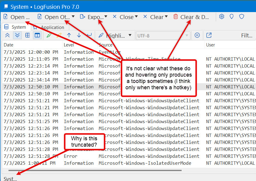
What scaling level are you using on that monitor?

InterSlice
6 discussion posts
I should have thought to mention that:
- scale: 225%
- monitor resolution: 1920x1080 (but looks same on my 2560x1440 monitor)
I can't seem to reproduce that here. If you exit and re-open the window does it still truncate?
InterSlice
6 discussion posts
Restarting LogFusion or even the computer doesn't change anything.
I noticed that LogFusion creates logs, so I've attached a couple (one from a run on each monitor in case it makes a difference).
I noticed there are several lines in the logs that mention DPI being 120% which doesn't match what the Win11 settings app says in "System > Display > Scale & Layout > Scale" (225%).
I have attached a zip file with the logs.
Thanks for looking into this.
• Attachment [protected]: 2025-07-14.logfusion.logs.zip [46,177 bytes]
InterSlice
6 discussion posts
Sure. LogFusionDebugInfo.zip attached.
• Attachment [protected]: LogFusionDebugInfo.zip [30,786 bytes]
InterSlice
6 discussion posts
Attached is the output from BFCustomerTest64.exe
• Attachment [protected]: 2025-07-16.BFCustomerTest64.output.txt [141,651 bytes]
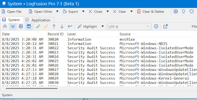
Thanks for sending that over. We should have this fixed up in our next beta, we'll let you know once it's released to test out.
We've released a new beta that should fix this up, please let me know if you run into any issues after updating.
Thanks!